Recent Work
Snapshots of larger projects to give you a feel for what I do.
RSSCub Notes Icon
Cub Notes
I'm working on a notes app. The aim is to combine the simplicity of Bear with a plain text, file-over-app workflow. The placeholder name is Cub. I created this icon set to go along with it. The final app probably won't use this name or icon to avoid confusion with Bear but I had some fun making it anyway.
Skills: icon design
Tools: figma
Node Settings
Voxie
This is a reusable UI for picking options on nodes in a workflow builder. Most of the work on this went into exploring variations on how to present and organize the options available. I needed something that worked just as well for a few options as it would for forty. I used chunking to break down sets of options into related categories for novice users and added search with a keyboard hotkey to allow expert users to quickly find what they needed. I also focused a lot on refining details like state transitions and interactions to give users a sense direction and space as they moved around.
Skills: design, animation, front-end dev
Tools: figma, tailwind, vue, astro, claude code
Autosave Interaction
Voxie
A prototype for notifying users that changes are being saved. I wanted to grab their attention but not use intrusive or distracting elements like pop-ups or toasts. This shows the user both that their work is being saved and where they can go to see the change history. To keep it from being annoying, the long-term intent would be for this to simplify as the user learns so only the inline animation shows.
Tools: figma, tailwind, vue, astro, claude code
AI Message Recommendations
Voxie
This prototype shows the interaction and loading states for an AI suggestion UI where the user writes guidance on how an agent should behave. AI suggestions can be invoked to improve what the user wrote. My main focus here was to create a fluid experience where details move and reveal in a pleasing way while keeping the overall interaction quick and responsive.
Skills: design, animation, front-end dev
Tools: figma, tailwind, vue, astro, claude code
Multi Select Threads
Voxie
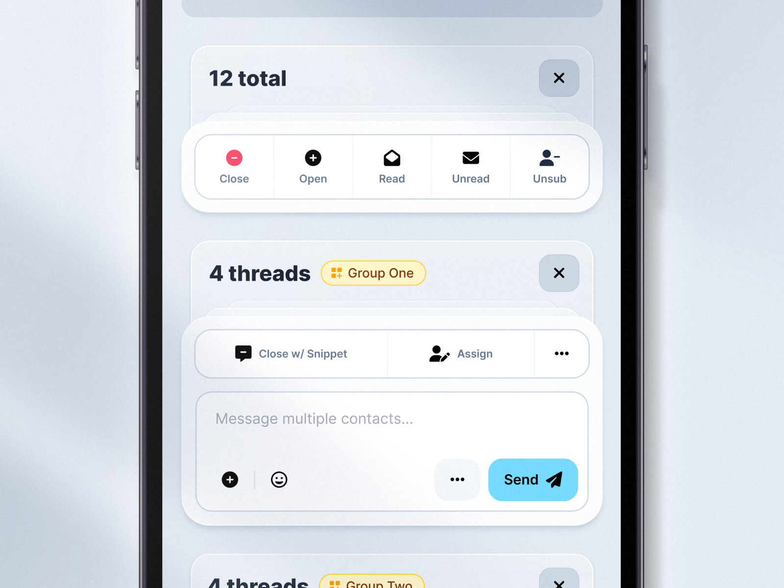
Voxie has a feature called groups that allows contacts to be associated with franchise locations. They also have a message hub where users can bulk select threads and process them. This design brings the two together so that a user can quickly triage incoming messages. We can't just show one set of actions for all threads because groups might have different phone numbers or feature access. Instead, we chunk the threads together with relevant actions surfaced for quick access.
Skills: design
Tools: figma
Input Error States
Voxie
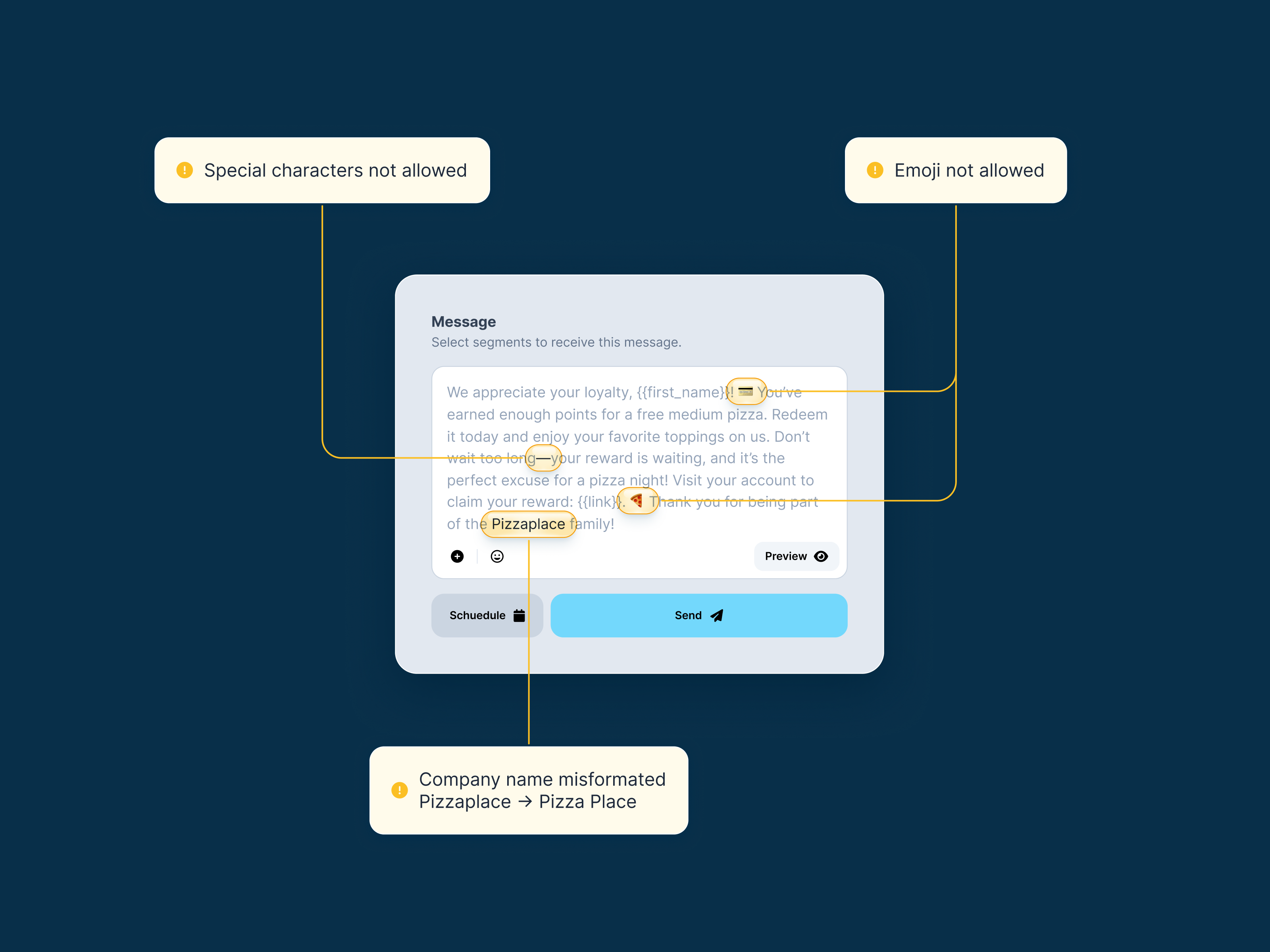
Experimenting with input validation styles. Can't decide if I like animating to normal state or shifting to success better. Normal state lets you get to a clean form but the success version gives you validation and doesn't cause layout shifts.
Skills: design, animation, front-end dev
Tools: figma, tailwind, vue, astro
Voxie Franchise Hero
Voxie
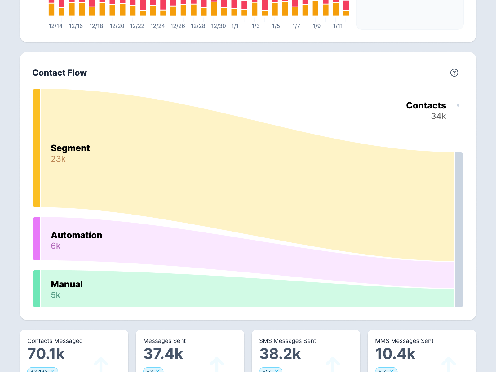
Voxie recently re-positioned itself to focus on it's core strengths revolving around franchises. I came up with this new interactive hero to illustrate those strengths. The key points I'm trying to show are the scale of messages franchise owners need to manage and how they can gather insights on performace across their network.
Skills: design, animation, front-end dev
Tools: figma, tailwind, vue, astro, google earth
Voxie Slide Out Menu
Voxie
Exploration for a collapsed menu UI pattern. This is a filter sidebar so the filter labels are important. Instead of going to icons like many sites do when a sidebar collapse I wanted to see what it would be like to simply clip the filter headers so you could still read what each item is and then see the full filter on click/tap. We ended up going a different direction but it was fun to work this idea out.
Action Menu
Voxie
An action menu that combines direct actions and links. This tries to differentiate between the two while keeping a consistent style. Actions are more prominent, links more subdued.
Opt-in Flow
Voxie
Voxie has a concept called Playbooks consisting of premade templates, assets, and automations to get customers quickly up and running with a campaign. This was designed to give a preview of what a specific playbook does and how a user flows throughs through it.
Skills: design, animation, front-end dev
Tools: figma, tailwind, vue, svg, astro
Slider
Voxie
Voxie needed a simple way to show feature updates in their product dashboard so I designed and built this slider from scratch. I did this partly because I didn't want to rely a third party library and partly because I thought it would be fun to learn how to implement this in Vue. Some of the things I tried to incorporate were an unobtrusive UI for the slider that also works intuitively. I did this by make a subtle navigation with progress indicators while also supporting native touch and trackpad swiping. I also went for a pretty large delay between autoplay slide changes to keep it less distracting (demo video shows it sped up).
Stacked Modal
Voxie
I designed and built this stacked modal pattern so we could have modular, reusable modals for specific pieces of info. This example uses it to add a new API authorization to an endpoint. It also allows us to keep modals concise and focused while also keeping spacial awareness through the app. We use this pattern very sparingly. The prototype shown here has multiple modals to test that the component can successfully accept any number of child modals but in practice, there would likely only ever be one stacked modal.

Warehouse Stowing App
Gentux
This tool was used for putting away garments back into inventory at a suit rental warehouse. I designed it to focus on one-handed use. Instead of typing locations, garment ids, user id, you use simply scan qr codes at each step and tap large buttons. A simple badge overlaid on the scan area tells you want to scan and if it was successful.

Date Picker UI
Generation Tux
Date pickers can be overwhelming and generate decision fatigue. Gentux need one as a part of its sign up flow where it could cause drop off. Instead of showing a full on date picker, I created one that stepped you through the process a little at a time. Three quick taps, and you're done.
FitPro App
Generation Tux
Gentux has a fit algorithm that can generate suit measurements very accurately from a few things like height, weight, and jean waist size. I decided to prototype how that could work as an app. The idea was that we could launch this as a simple standalone tool. If people found it useful, they might rent with us.
