Zenti
Intro
Project
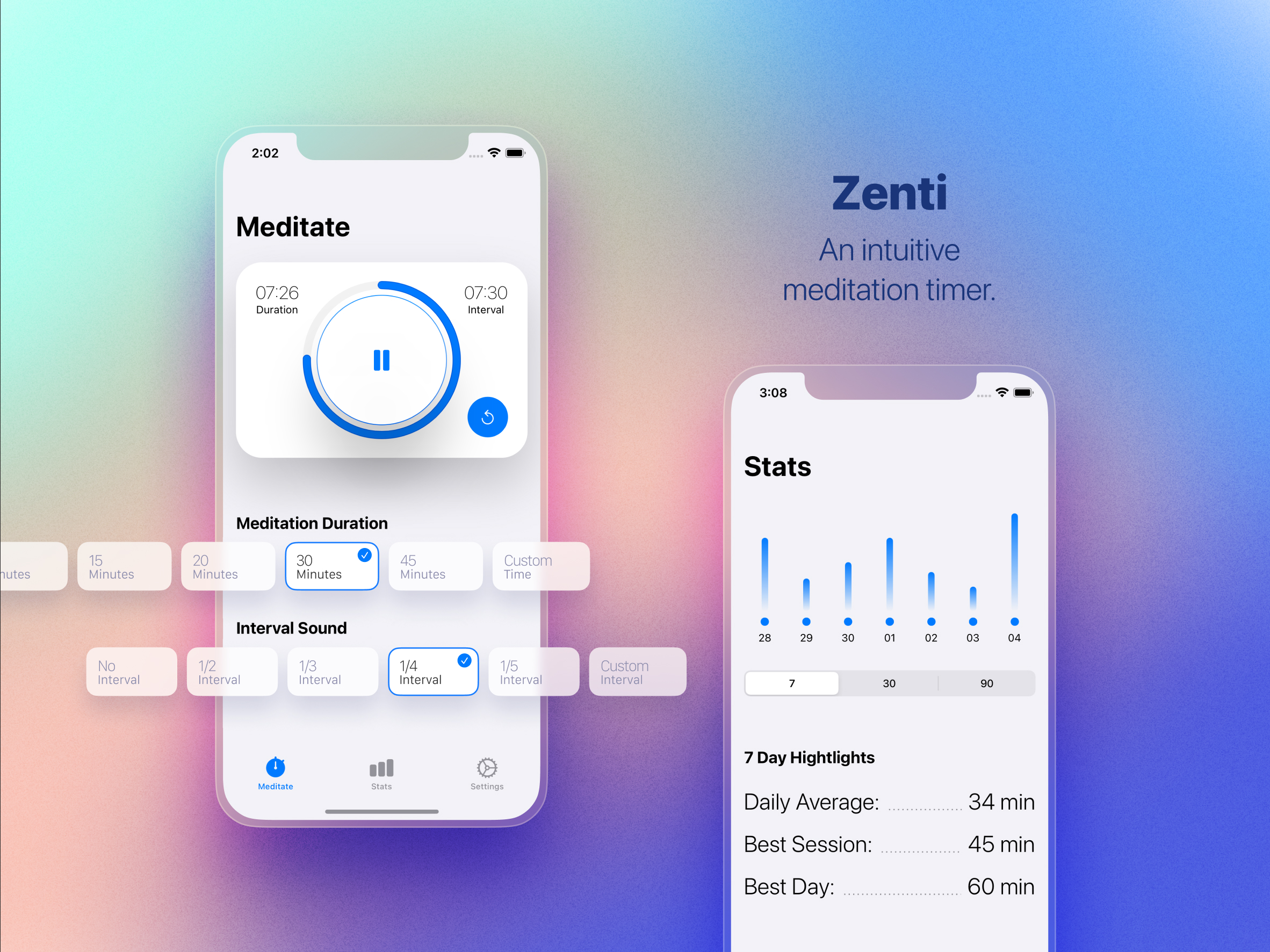
Zenti Meditation Timer. Available in the AppStore .
The Challenge
Create a meditation app that prioritizes ease-of-use while providing options for detailed customization.
Details
Wait, but why?
Aren’t there enough meditation apps out there?

1. An educational exercise
I’ve been trying to learn iOS development on and off for years. It never really stuck. When SwiftUI came along, everything changed. It just made sense to me. I had fun with it for a while following along with Recreate UI. Then, I decided to get more serious and committed to doing 100 Days of SwiftUI. When I finished those courses, I couldn’t wait to build my own app.
This all happened in the middle of the pandemic so I’d also been learning more about meditation as a way to relax and cope with everything going on. I found myself constantly frustrated by the apps on the market and decided that would be a great target for my first app.
2. Finding a niche in a crowded market
There are tons of apps in the meditation space and while this was a learning exercise for me, I figured I should at least try and make something that others would find useful. Otherwise, what’s the point? So, I started thinking about what frustrates me in the other apps and how I could stand out. I found my answers very quickly.
Get out of my way, I just
want
to meditate.
My biggest problem with the existing mediation market was the flood of distractions. The apps had content feeds, tutorials, social media, events, and other features that I cared nothing about. I also struggled with the focus on beginners. They simplified the timer so much that you couldn’t dial in specific settings.
What was available:
- Forced Account Creation
- Data Tracking
- Subscriptions
- Learn, Discover
- Content Feeds
- Social Media
- Events, Celebrities
- Hard to use
What I wanted:
- A Timer
- Intervals
- HealthKit Support
- Stats
- Customization
- Easy to Use
In short, if you wanted to do a simple, unguided meditation, it was a pain. I was going to try and fix that.
If you wanted to do an unguided meditation, it was a pain. I was going to try and fix that.
Design
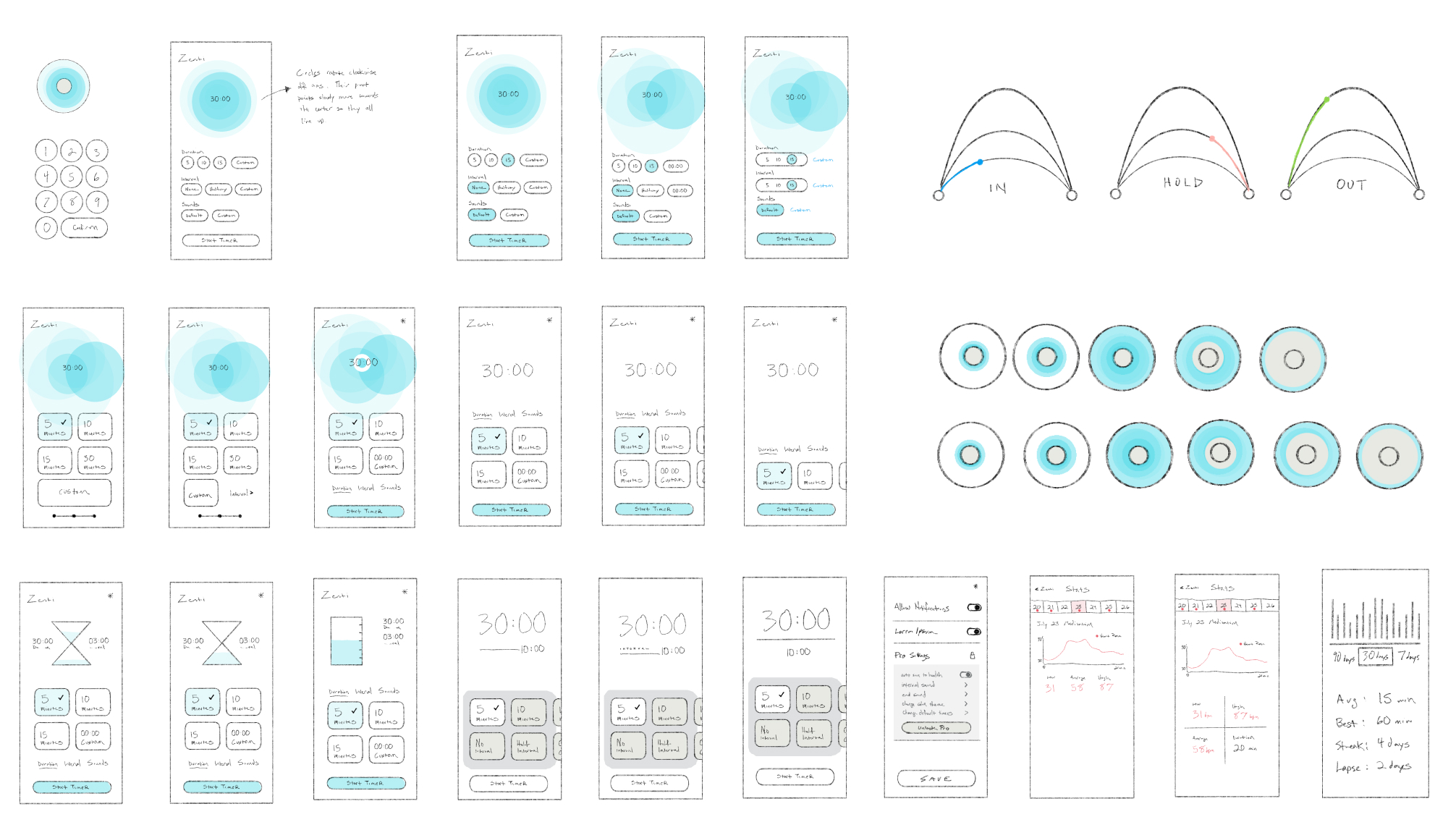
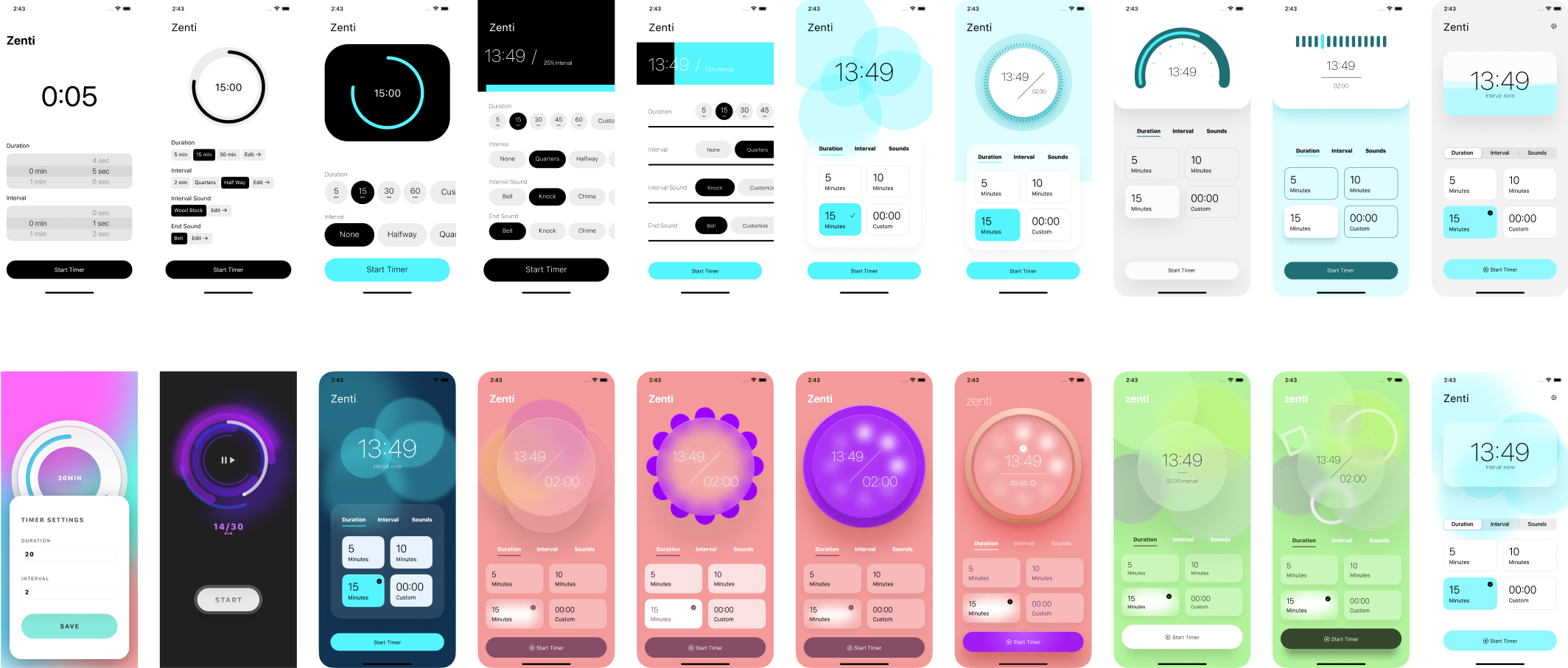
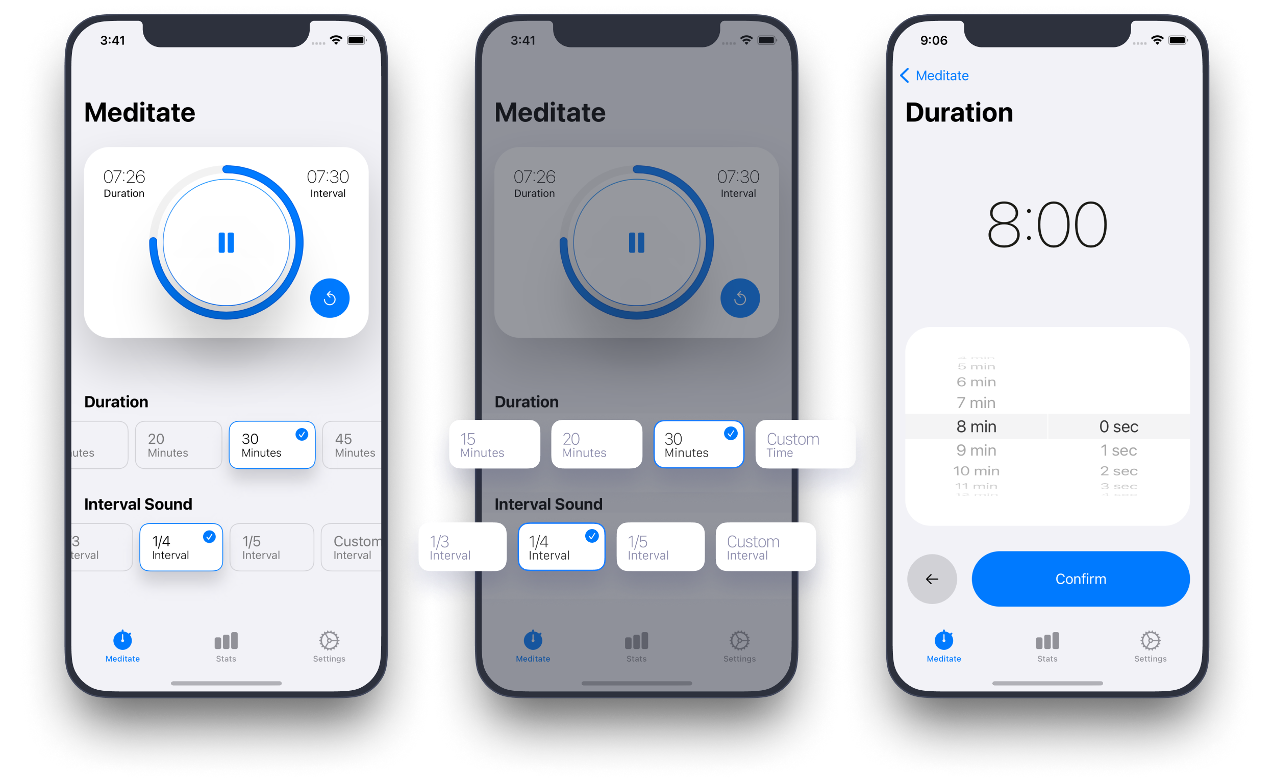
I went through many design iterations but they all shared one core idea. Make it as easy as possible to start a meditation when you open the app. That meant surfacing details like the duration and interval settings on the main screen.
To keep things user friendly I tried to find a balance between simplified options that would make starting a timer quick while also providing advanced settings for those that needed them.
The “Final” Product
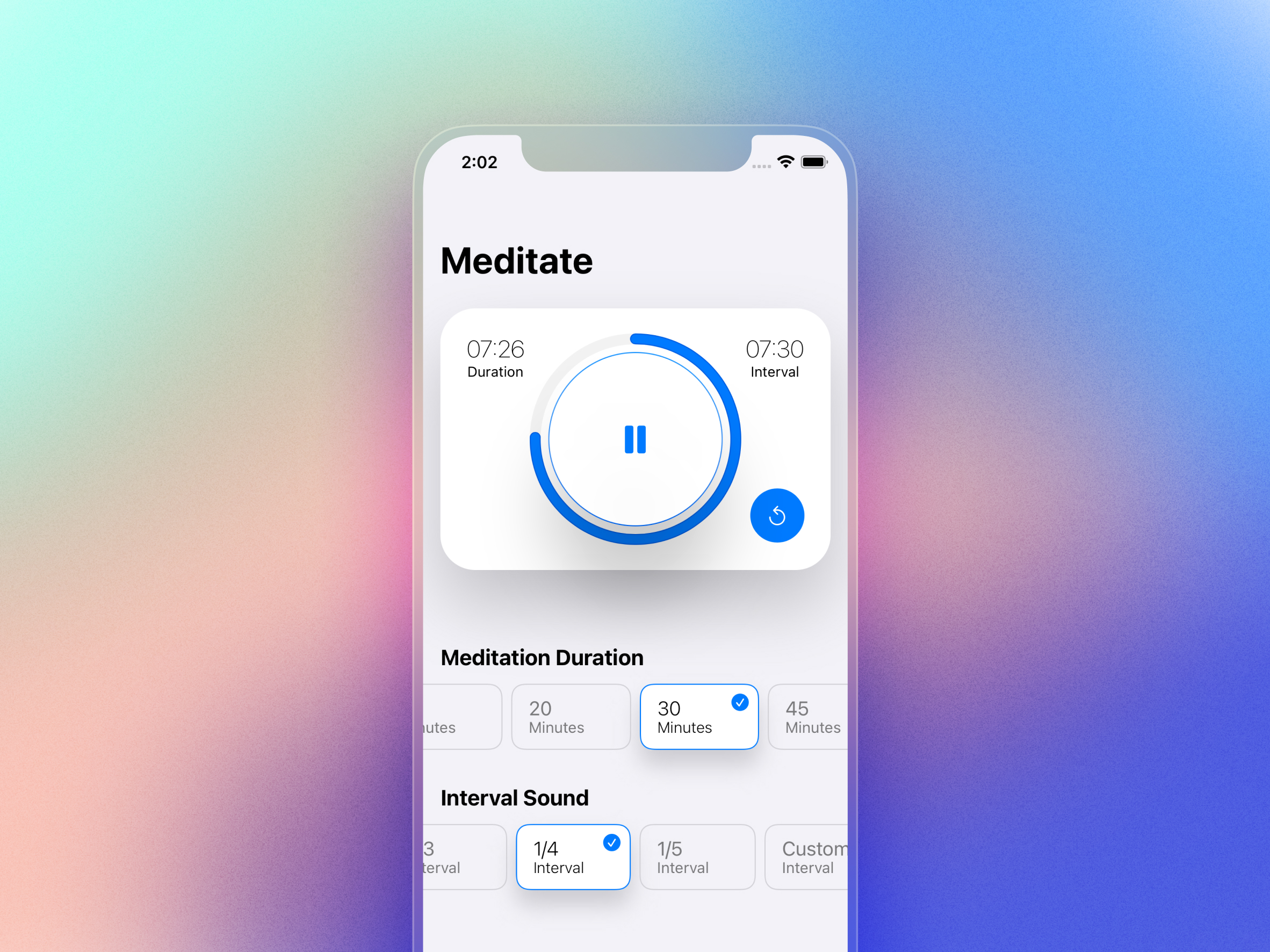
Zenti ended up in a pretty good spot. I was able to incorporate all the main features I wanted and I’m pretty happy with the results.
Highlights:
- Large play/pause button
- Swipeable options to save space while allowing easy access to a full range of choices
- Bottom tab bar to keep app navigation within reach
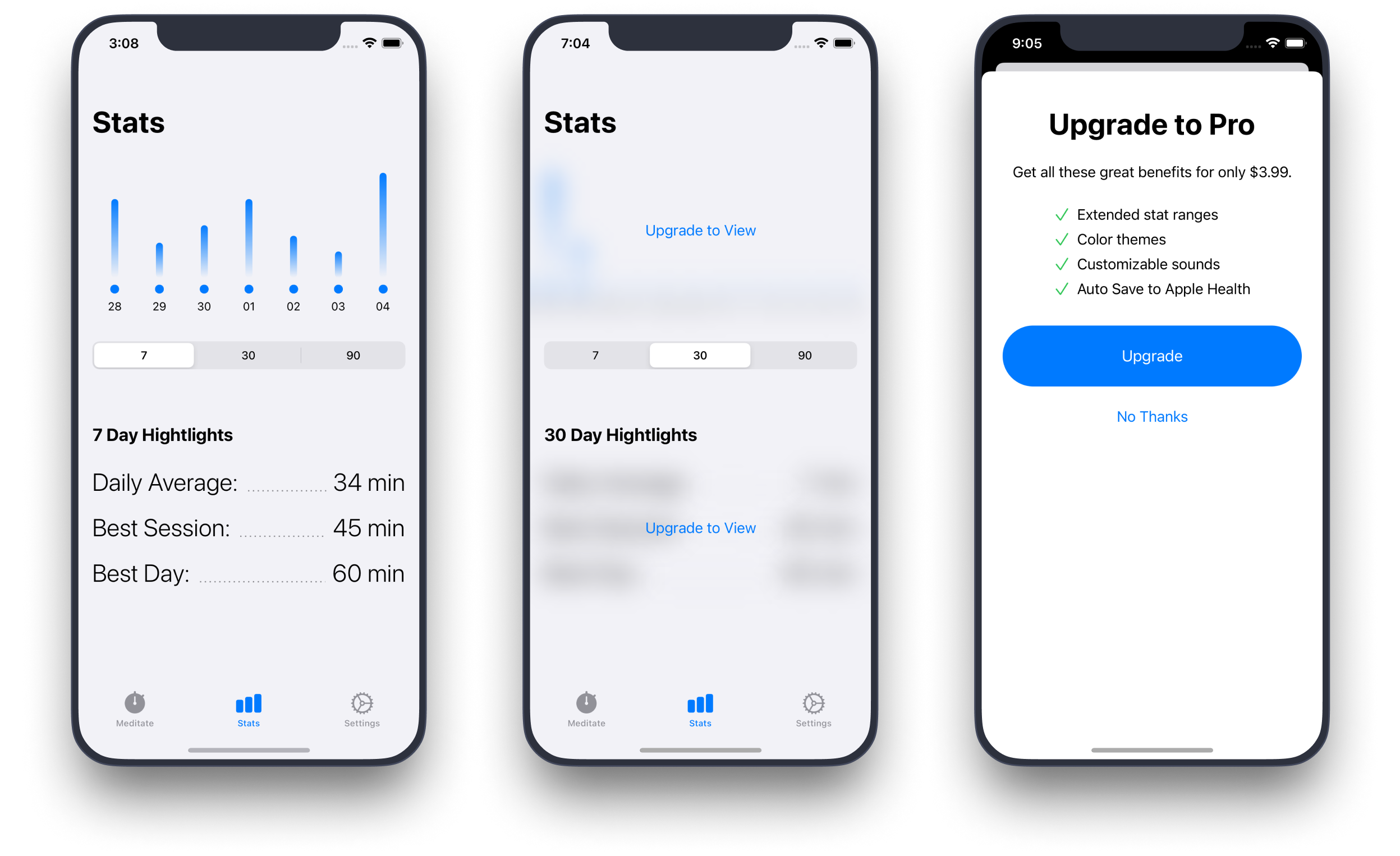
- Simplified stats screen with key highlights
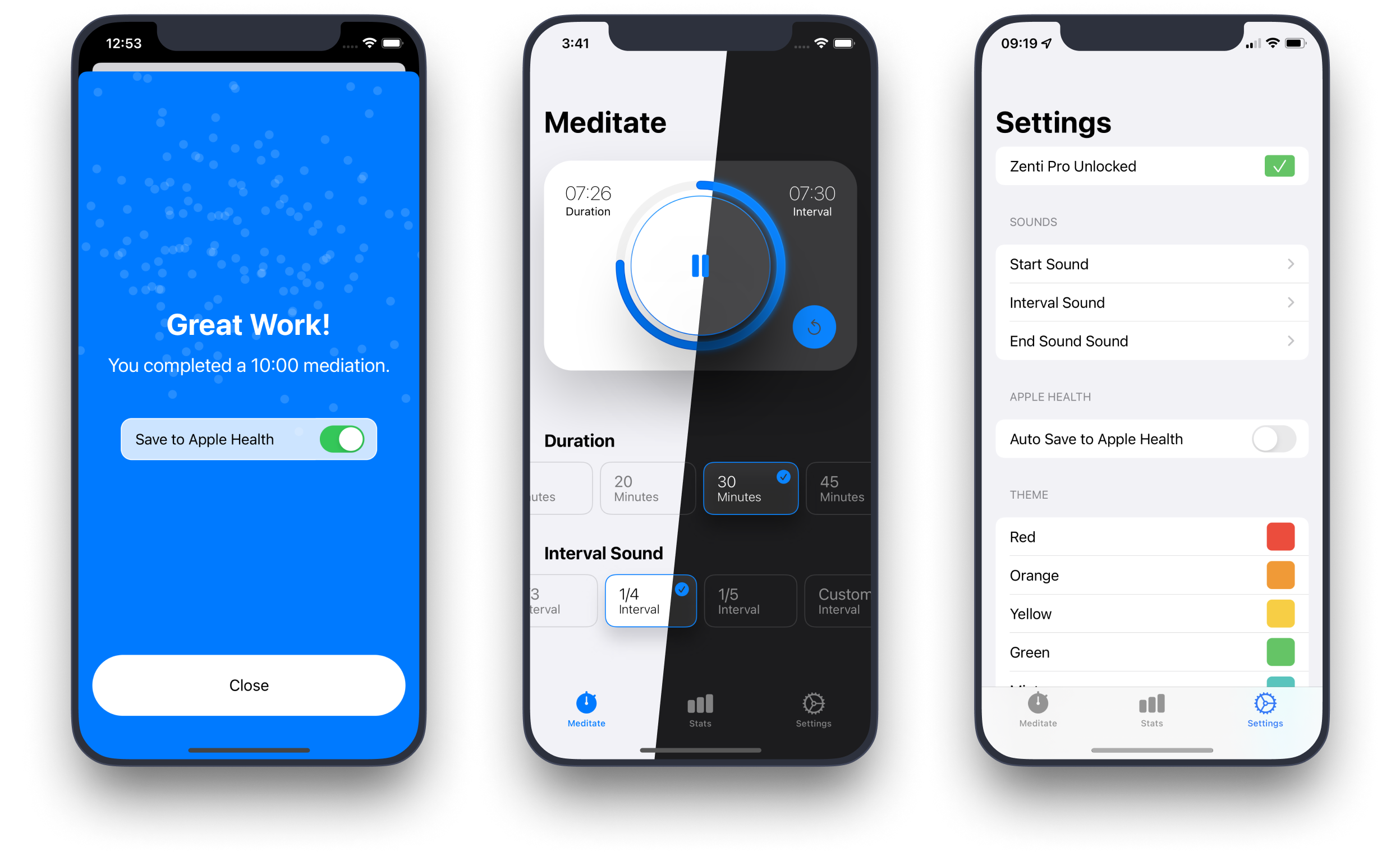
- Light and dark modes
- Themes
Challenges
Of course learning a new programming language is going to be hard but that was expected so it didn’t stand out as a big deal. It’s always the unexpected challenges that stick with me.
Dark Mode
One of those was dark mode. I’ve been designing UIs for years but haven’t had to tackle dark mode before. Even for an app a small as this one, it was tough because I had to combine it with themes. For every color theme I wanted to provide, I needed to think through how that would work in light and dark mode on every screen.
Here are a few of the ways I tackled this problem:
- I simplified the app design by moving from a full background color to using color as accent. This reduced the color complexity.
- I relied on Apple’s system colors instead of custom ones becaus they provide color variants for light and dark modes plus options to increase legibility.
I have a new found respect for the work that goes into creating dark mode especially for bigger apps.
How’s it going? So, so.
Sales

Sessions

Updates

Active Devices

Downloads

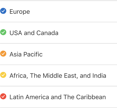
Regions
Results
Overall, I’m happy that people are using it. Some enjoy it enough to give me money. If this wasn’t the case, I’d still make the app because I find it useful and building things is an incredible way to learn.
Insights
There are some insights I’ve gained from that data though.
- The first is that I didn’t expect the majority of users to be from outside the United States. I Don’t know why I assumed that but now I’m making strides to accommodate other languages. An example is the interval labels. Instead of using words like half, third, quarter, I switched to fractions like 1/2, 1/3, 1/4. The ultimate goal would be to have multilingual translations.
- The second is that sales always coincide with updates. So I need to coordinate my requests for people to upgrade with new feature releases.
