I learn, sketch, wireframe, prototype, and code. I use all these skills to translate user needs into usable, delightful interfaces and I have fun doing it.
Experimenting with input validation styles. Can't decide if I like animating to normal state or shifting to success better. Normal state lets you get to a clean form but the success version gives you validation and doesn't cause layout shifts.
Skills: design, animation, front-end dev
Tools: figma, tailwind, vue, astro
Client: Voxie
More: https://voxie.com
Voxie is doing some customer outreach to gauge interest on a new feature that allows franchise companies to run validation at scale on outbound sms messages from hundreds of locations. I created this little graphic to quickly illustrate the idea.
Skills: design
Tools: figma
Client: Voxie
More: https://voxie.com
Voxie recently re-positioned itself to focus on it's core strengths revolving around franchises. I came up with this new interactive hero to illustrate those strengths. The key points I'm trying to show are the scale of messages franchise owners need to manage and how they can gather insights on performace across their network.
Skills: design, animation, front-end dev
Tools: figma, tailwind, vue, astro, google earth
Client: Voxie
More: https://voxie.com
Exploration for a collapsed menu UI pattern. This is a filter sidebar so the filter labels are important. Instead of going to icons like many sites do when a sidebar collapse I wanted to see what it would be like to simply clip the filter headers so you could still read what each item is and then see the full filter on click/tap. We ended up going a different direction but it was fun to work this idea out.
Client: Voxie
More: https://voxie.com
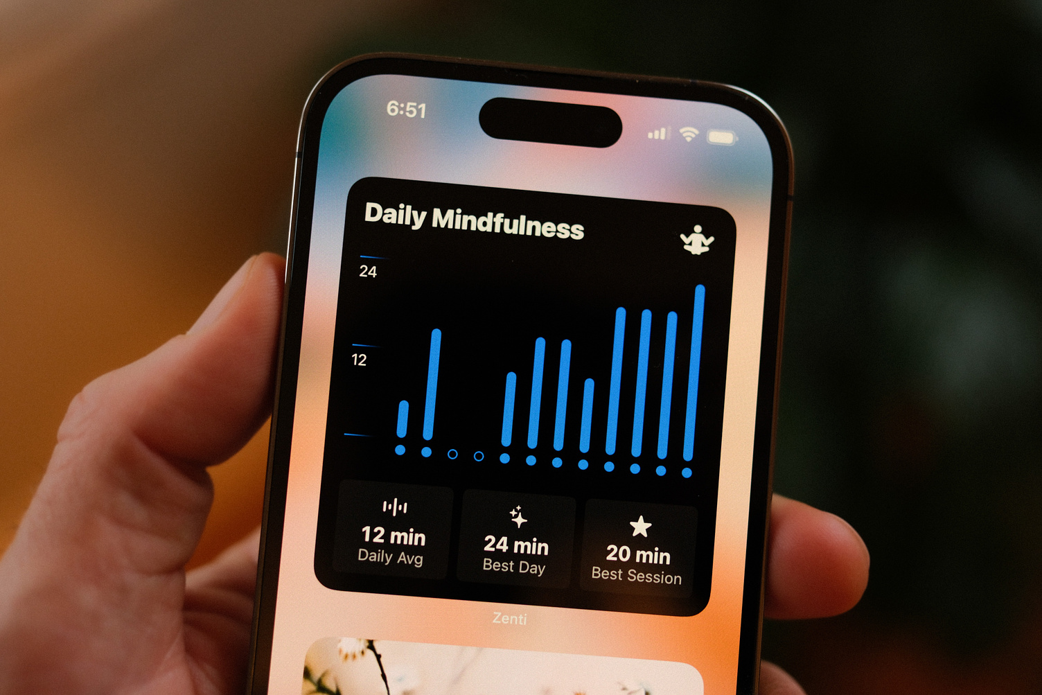
I finally got around to updating these app icons for darkmode and tinted mode on iOS. The originals were already on dark backgrounds so they worked ok but it feels so much nicer to have them fine tuned for these purposes.
Client: The Web Workers
More: https://thewebworkers.co
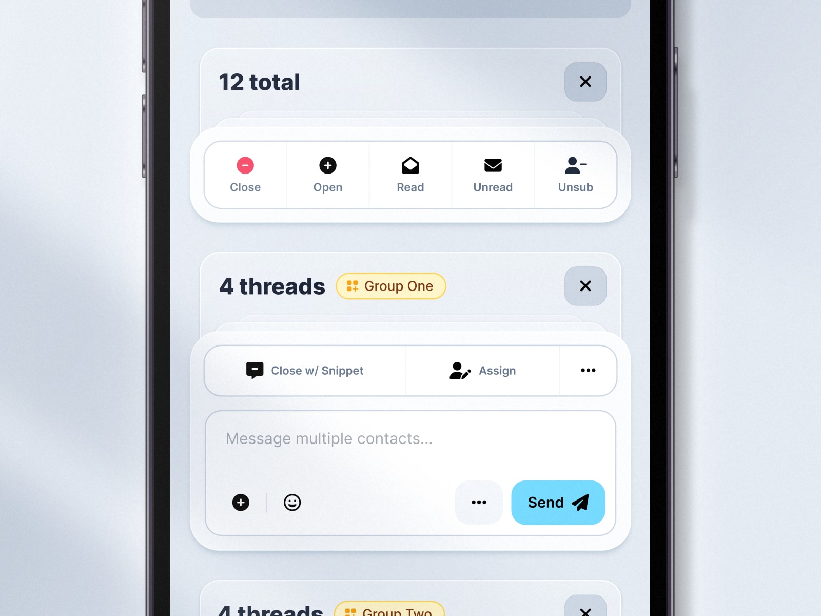
Recreated the Voxie Message Hub web app on mobile. We made platform specific versions using native UI for iOS and Android but ultimately decided to go with a unified design to lighten dev efforts and to keep a consistent user experience across platforms.
Client: Voxie
More: https://voxie.com
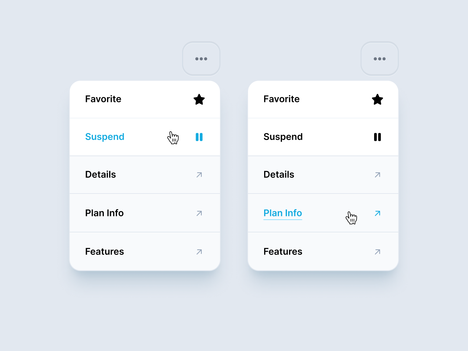
An action menu that combines direct actions and links. This tries to differentiate between the two while keeping a consistent style. Actions are more prominent, links more subdued.
Client: Voxie
More: https://voxie.com
Spent the weekend on some UI updates to Stakburn. Made it a little more kid friendly so my son could work on his sight words. Added swipe actions and the ability to tap to hear the word aloud. He likes to cheat though so I had to disable the correct swipe if audio played 😄
Client: Stakburn
More: https://stakburn.com
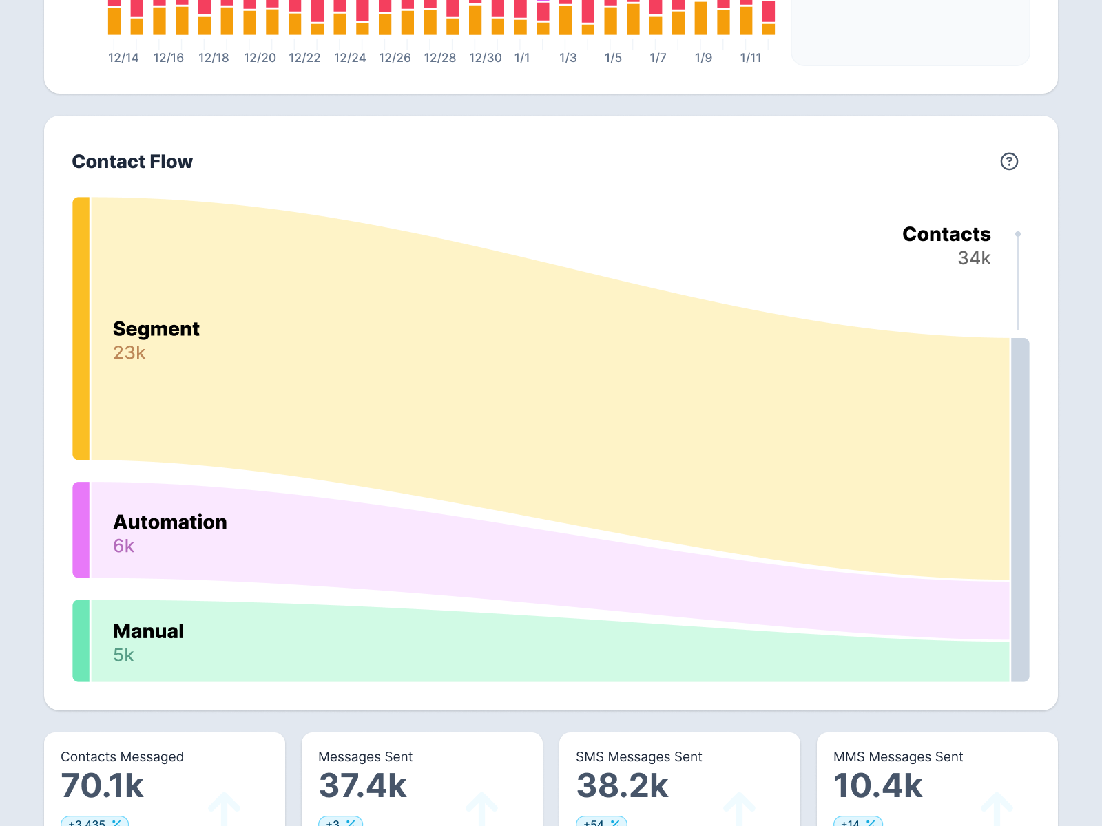
Chart designed to show the source breakdown of contacts in a campaign.
Client: Voxie
More: https://voxie.com